![]()

Tutorial 5: Calculating Anomalies Using Precipitation Data#
Week 1, Day 3, Remote Sensing
Content creators: Douglas Rao
Content reviewers: Katrina Dobson, Younkap Nina Duplex, Maria Gonzalez, Will Gregory, Nahid Hasan, Sherry Mi, Beatriz Cosenza Muralles, Jenna Pearson, Agustina Pesce, Chi Zhang, Ohad Zivan
Content editors: Jenna Pearson, Chi Zhang, Ohad Zivan
Production editors: Wesley Banfield, Jenna Pearson, Chi Zhang, Ohad Zivan
Our 2023 Sponsors: NASA TOPS and Google DeepMind
Tutorial Objectives#
In this tutorial, you will learn how to calculate climate anomalies using satellite climate data records.
By the end of this tutorial you will be able to:
Calculate an anomaly to a climatology.
Calculate the rolling mean of the anomaly data to smooth the time series and extract long-term signals/patterns.
Setup#
# installations ( uncomment and run this cell ONLY when using google colab or kaggle )

# !pip install s3fs --quiet

# # properly install cartopy in colab to avoid session crash
# !apt-get install libproj-dev proj-data proj-bin --quiet
# !apt-get install libgeos-dev --quiet
# !pip install cython --quiet
# !pip install cartopy --quiet
# !pip install geoviews

# !apt-get -qq install python-cartopy python3-cartopy  --quiet
# !pip uninstall -y shapely  --quiet
# !pip install shapely --no-binary shapely  --quiet

# !pip install boto3 --quiet

# you may need to restart the runtime after running this cell and that is ok
# imports
import s3fs
import xarray as xr
import numpy as np
import matplotlib.pyplot as plt
import cartopy
import cartopy.crs as ccrs
import boto3
import botocore
import os
import pooch
import tempfile
import holoviews
from geoviews import Dataset as gvDataset
import geoviews.feature as gf
from geoviews import Image as gvImage
Figure Settings#
Show code cell source
# @title Figure Settings
import ipywidgets as widgets  # interactive display

%config InlineBackend.figure_format = 'retina'
plt.style.use(
    "https://raw.githubusercontent.com/ClimateMatchAcademy/course-content/main/cma.mplstyle"
)
Helper functions#
Show code cell source
# @title Helper functions

def pooch_load(filelocation=None, filename=None, processor=None):
    shared_location = "/home/jovyan/shared/data/tutorials/W1D3_RemoteSensingLandOceanandAtmosphere"  # this is different for each day
    user_temp_cache = tempfile.gettempdir()

    if os.path.exists(os.path.join(shared_location, filename)):
        file = os.path.join(shared_location, filename)
    else:
        file = pooch.retrieve(
            filelocation,
            known_hash=None,
            fname=os.path.join(user_temp_cache, filename),
            processor=processor,
        )

    return file
Section 1: From Climatology to Anomaly#
Building upon your knowledge of climatology from the last tutorial, you will now calculate the anomalies from this climatology. An anomaly, in the context of climate studies, represents a departure from standard climatological conditions. For example, if the normal January temperature of the city that you live in is 10 °C and the January temperature of this year is 15 °C. We usually say the temperature anomaly of January this year is 5 °C above normal/ the climatology. The anomaly is an essential tool in detecting changes in climate patterns and is frequently utilized in critical climate reports such as those generated by the Intergovernmental Panel on Climate Change (IPCC).
To calculate an anomaly, we first establish a reference period, usually a 30-year window, to define our climatology. In this process, it is crucial to use high-quality data and aggregate it to the desired spatial resolution and temporal frequency, such as weekly or monthly. The anomaly is then determined by subtracting this long-term average from a given observation, thus creating a useful metric for further climate analysis such as trend analysis.
In this tutorial, we will employ the CPCP monthly precipitation Climate Data Record (CDR) to compute a monthly anomaly time series. Furthermore, we will learn to calculate the rolling mean of the generated precipitation anomaly time series. This knowledge will be invaluable for our upcoming tutorial on climate variability.
Section 1.1: Calculating the Monthly Anomaly#
To calculate anomaly, you first need to calculate the monthly climatology. Since you already learned how to do this during last tutorial, we will fast forward this step.
# connect to the AWS S3 bucket for the GPCP Monthly Precipitation CDR data
fs = s3fs.S3FileSystem(anon=True)

# get the list of all data files in the AWS S3 bucket
file_pattern = "noaa-cdr-precip-gpcp-monthly-pds/data/*/gpcp_v02r03_monthly_*.nc"
file_location = fs.glob(file_pattern)

# open connection to all data files
client = boto3.client(
    "s3", config=botocore.client.Config(signature_version=botocore.UNSIGNED)
)  # initialize aws s3 bucket client
file_ob = [
    pooch_load(filelocation="http://s3.amazonaws.com/" + file, filename=file)
    for file in file_location
]

# open all the monthly data files and concatenate them along the time dimension
# this process will take ~ 1 minute to complete due to the number of data files
ds = xr.open_mfdataset(file_ob, combine="nested", concat_dim="time")

# comment for colab users only: this could toss an error message for you.
# you should still be able to use the dataset with this error just not print ds
# you can try uncommenting the following line to avoid the error
# ds.attrs['history']='' # the history attribute have unique chars that cause a crash on Google colab.
ds
<xarray.Dataset> Size: 46MB
Dimensions: (latitude: 72, longitude: 144, time: 540, nv: 2)
Coordinates:
* latitude (latitude) float32 288B -88.75 -86.25 -83.75 ... 86.25 88.75
* longitude (longitude) float32 576B 1.25 3.75 6.25 ... 353.8 356.2 358.8
* time (time) datetime64[ns] 4kB 1979-01-01 1979-02-01 ... 2023-12-01
Dimensions without coordinates: nv
Data variables:
lat_bounds (time, latitude, nv) float32 311kB dask.array<chunksize=(1, 72, 2), meta=np.ndarray>
lon_bounds (time, longitude, nv) float32 622kB dask.array<chunksize=(1, 144, 2), meta=np.ndarray>
time_bounds (time, nv) datetime64[ns] 9kB dask.array<chunksize=(1, 2), meta=np.ndarray>
precip (time, latitude, longitude) float32 22MB dask.array<chunksize=(1, 72, 144), meta=np.ndarray>
precip_error (time, latitude, longitude) float32 22MB dask.array<chunksize=(1, 72, 144), meta=np.ndarray>
Attributes: (12/45)
Conventions: CF-1.6, ACDD 1.3
title: Global Precipitation Climatatology Project (G...
source: oc.197901.sg
references: Huffman et al. 1997, http://dx.doi.org/10.117...
history: 1) �R
`�, Dr. Jian-Jian Wang, U of Maryland,...
Metadata_Conventions: CF-1.6, Unidata Dataset Discovery v1.0, NOAA ...
... ...
metadata_link: gov.noaa.ncdc:C00979
product_version: v23rB1
platform: NOAA POES (Polar Orbiting Environmental Satel...
sensor: AVHRR>Advanced Very High Resolution Radiometer
spatial_resolution: 2.5 degree
comment: Processing computer: eagle2.umd.edu# calculate climatology using `.sel()` and `.groupby()` directly.
precip_clim = (
ds.precip.sel(time=slice("1981-01-01", "2010-12-01"))
.groupby("time.month")
.mean(dim="time")
)
precip_clim
<xarray.DataArray 'precip' (month: 12, latitude: 72, longitude: 144)> Size: 498kB
dask.array<transpose, shape=(12, 72, 144), dtype=float32, chunksize=(1, 72, 144), chunktype=numpy.ndarray>
Coordinates:
  * latitude   (latitude) float32 288B -88.75 -86.25 -83.75 ... 86.25 88.75
  * longitude  (longitude) float32 576B 1.25 3.75 6.25 ... 353.8 356.2 358.8
  * month      (month) int64 96B 1 2 3 4 5 6 7 8 9 10 11 12
Attributes:
    long_name:      NOAA Climate Data Record (CDR) of GPCP Monthly Satellite-...
    standard_name:  precipitation amount
    units:          mm/day
    valid_range:    [  0. 100.]
cell_methods: area: mean time: meanNow we have the monthly precipitation climatology. How can we calculate the monthly anomaly?
As we learned before - let’s use .groupby() from xarray. We can split the entire time period based on the month of the year and then subtract the climatology of that specific month from the monthly value and recombine the value together.
# use `.groupby()` to calculate the monthly anomaly
precip_anom = ds.precip.groupby("time.month") - precip_clim
precip_anom
/opt/hostedtoolcache/Python/3.9.19/x64/lib/python3.9/site-packages/xarray/core/indexing.py:1430: PerformanceWarning: Slicing with an out-of-order index is generating 45 times more chunks
  return self.array[key]
<xarray.DataArray 'precip' (time: 540, latitude: 72, longitude: 144)> Size: 22MB
dask.array<sub, shape=(540, 72, 144), dtype=float32, chunksize=(1, 72, 144), chunktype=numpy.ndarray>
Coordinates:
  * latitude   (latitude) float32 288B -88.75 -86.25 -83.75 ... 86.25 88.75
  * longitude  (longitude) float32 576B 1.25 3.75 6.25 ... 353.8 356.2 358.8
  * time       (time) datetime64[ns] 4kB 1979-01-01 1979-02-01 ... 2023-12-01
month (time) int64 4kB 1 2 3 4 5 6 7 8 9 10 ... 3 4 5 6 7 8 9 10 11 12You may have noticed that there is an additional coordinate in the anomaly dataset. The additional coordinate is month which is a direct outcome because of the .groupby() action we just performed.
If you want to save the data for future use, you can write the data out to a netCDF file using .to_netcdf(). It will automatically carry all the coordinates, dimensions, and relevant information into the netCDF file.
# an example of how to export the GPCP monthly anomaly data comparing to the climatology period of 1981-2010.
# precip_anom.to_netcdf('t5_gpcp-monthly-anomaly_1981-2010.nc')
Section 1.2: Examining the Anomaly#
First, let’s take a look at the geospatial pattern of the monthly anomaly of a selected month – January of 1979.
# initate plot
fig = plt.figure(figsize=(9, 6))

# set map projection
ax = plt.axes(projection=ccrs.Robinson())

# add coastal lines to indicate land/ocean
ax.coastlines()

# add grid lines for latitude and longitude
ax.gridlines()

# add the precipitation data for
precip_anom.sel(time="1979-01-01").plot(
    ax=ax,
    transform=ccrs.PlateCarree(),
    vmin=-8,
    vmax=8,
    cmap="BrBG",
    cbar_kwargs=dict(shrink=0.5, label="Monthly Anomaly \n(mm/day)"),
)
<cartopy.mpl.geocollection.GeoQuadMesh at 0x7f2d948fe130>
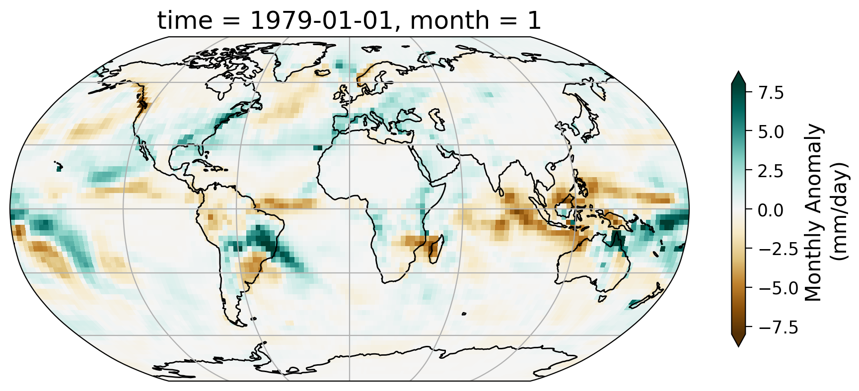
From the map of this monthly anomaly, we can see the spatial pattern of how precipitation for the January of 1979 has departed from the 30-year normal. Part of the Amazon saw notable increase of precipitation during this month as well as the northeast coast of the United States.
Interactive Demo 1.2#
In the interactive demo below (make sure to run the code) you will be able to scroll through the anomaly for a few months in 1979 to see how it changes from month to month during this year.
holoviews.extension("bokeh")
dataset_plot = gvDataset(
    precip_anom.isel(time=slice(0, 10))
)  # only the first 10, as it is a time consuming task
images = dataset_plot.to(gvImage, ["longitude", "latitude"], ["precip"], "time")
images.opts(
    cmap="BrBG",
    colorbar=True,
    width=600,
    height=400,
    projection=ccrs.Robinson(),
    clim=(-8, 8),
    clabel="Monthly Anomaly \n(mm/day)",
) * gf.coastline


To visualize the changes in the precipitation anomaly over many months, we can also take a look at the time series of a selected grid. We will use the same point (0°N, 0°E) that we used as an example in the last tutorial.
# set up two subplots that share the x-axis to compare monthly precipitation and monthly anomaly
fig, axs = plt.subplots(2, sharex=True)
fig.suptitle("GPCP Monthly Precipitaion v.s. Monthly Anomaly")
axs[0].plot(ds.time, ds.precip.sel(latitude=0, longitude=0, method="nearest"))
axs[0].set_ylabel("Precip (mm/day)")
axs[1].plot(
    precip_anom.time, precip_anom.sel(latitude=0, longitude=0, method="nearest")
)
axs[1].set_ylabel("Anomaly (mm/day)")
axs[1].set_xlabel("Time")

# add horizontal line of y=0 for the anomaly subplot
axs[1].axhline(y=0, color="k", linestyle="-")
<matplotlib.lines.Line2D at 0x7f2d909f3cd0>
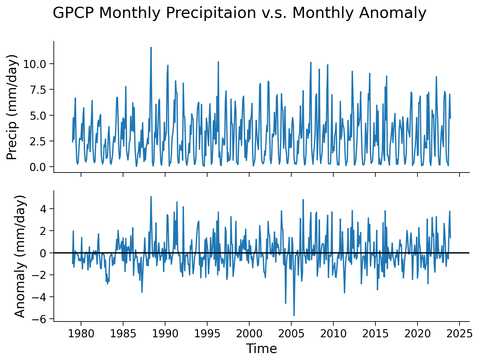
Note that, unlike the upper panel showing precipitation values, the lower panel displaying the monthly anomaly not exhibit distinct seasonal cycles. This discrepancy highlights one of the advantages of utilizing anomaly data for climate analysis. By removing the repetitive patterns induced by seasonality or other stable factors, we can effectively isolate the specific signals in the data that are of interest, such as climate variability or climate trends. This approach allows for a clearer focus on the desired climate-related patterns without the interference of predictable seasonal variations.
Section 2: Anomaly Analysis#
In this section, we are going to explore a few different analyses on the anomaly data:
Calculating rolling mean
Calculating global mean
You have already practiced using these tools during the last two days or material, here we will focus on applying them to a much longer satellite data record than you have encountered previously.
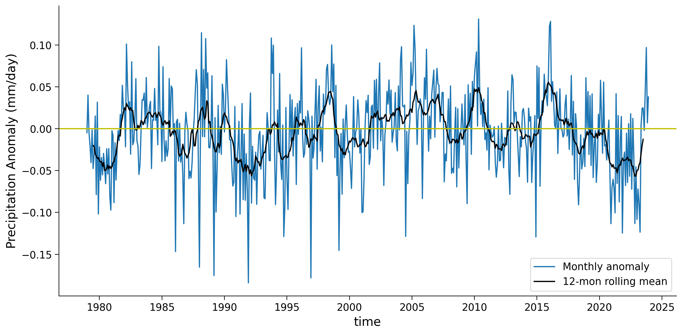
Section 2.1: Rolling Mean#
The monthly anomaly time series often contains noisy data that may obscure the patterns associated with large-scale climate variability. To mitigate this noise and enhance the visibility of underlying patterns, we can apply a rolling mean technique using the .rolling() function. This approach involves smoothing the monthly time series to facilitate the identification of climate variability.
# calculate 12-month rolling mean for the selected location
grid_month = precip_anom.sel(latitude=0, longitude=0, method="nearest")
grid_rolling = grid_month.rolling(time=12, center=True).mean()
# create the time series plot of monthly anomaly
fig, ax = plt.subplots(figsize=(12, 6))
grid_month.plot(label="Monthly Anomaly", ax=ax)
grid_rolling.plot(color="k", label="12-mon rolling mean", ax=ax)
ax.axhline(y=0, color="y", linestyle="-")
ax.set_ylabel("Precipitation Anomaly (mm/day)")
ax.legend()
ax.set_xlabel("Time")
# remove the automatically generated title
ax.set_title("")
Text(0.5, 1.0, '')
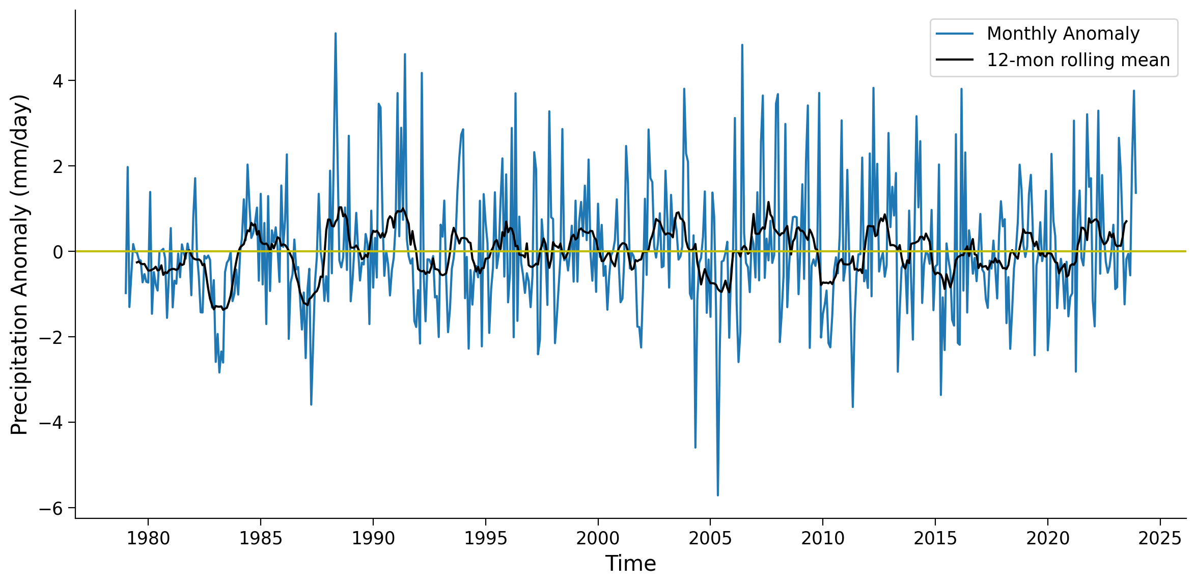
As you can see, the 12-month rolling mean removes the high-frequency variations of monthly precipitation anomaly data, allowing the slower-changing patterns of precipitation to become more apparent.
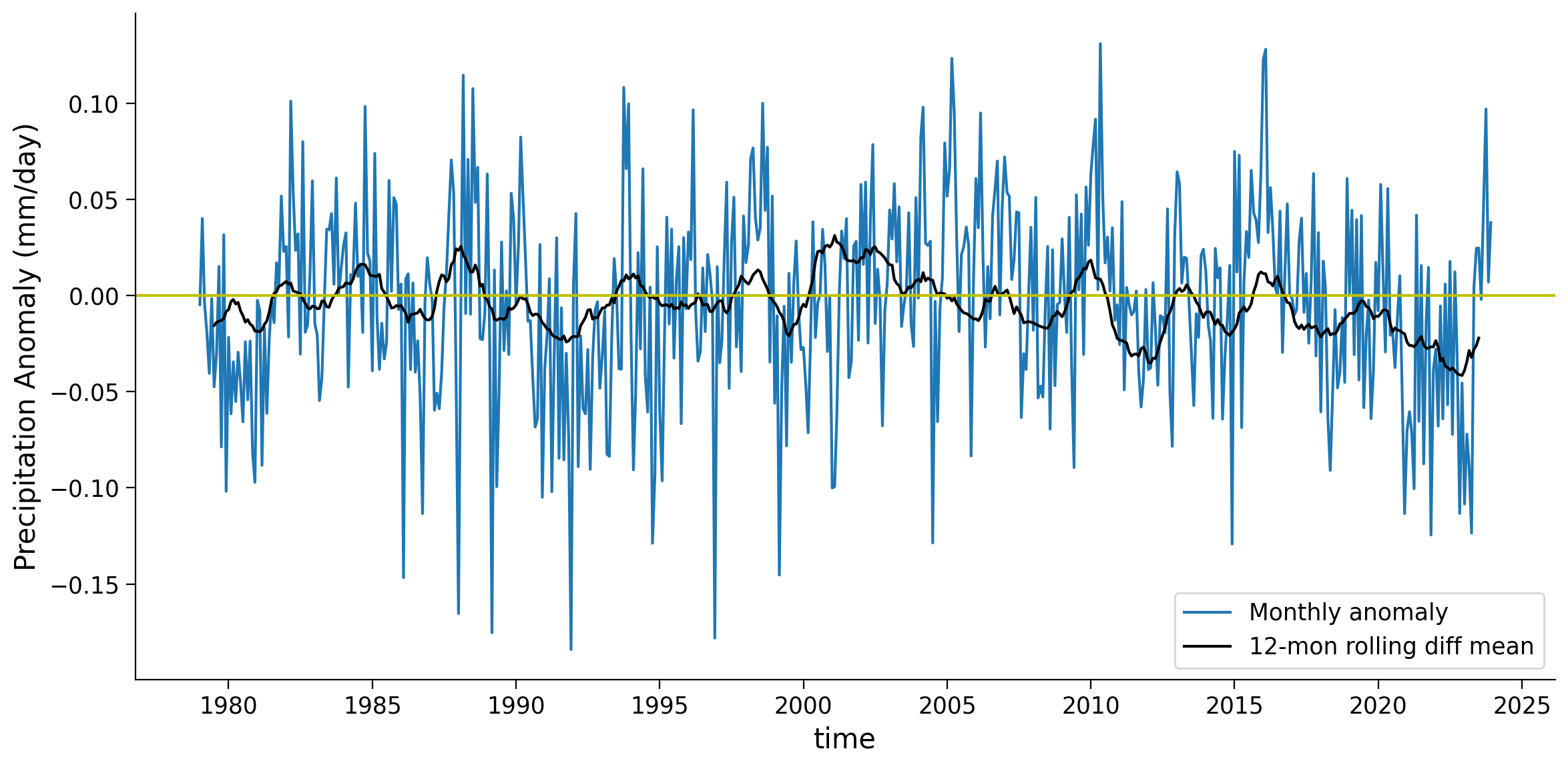
Coding Exercises 2.1#
Calculate the 24-month rolling mean for the same grid and compare the three different time series (monthly anomaly, 12-month rolling mean, 24-month rolling mean).
# calculate 24-month rolling mean
# grid_rolling_24m = ...

# plot all three time series together with different colors
# fig, ax = ...
Example output:
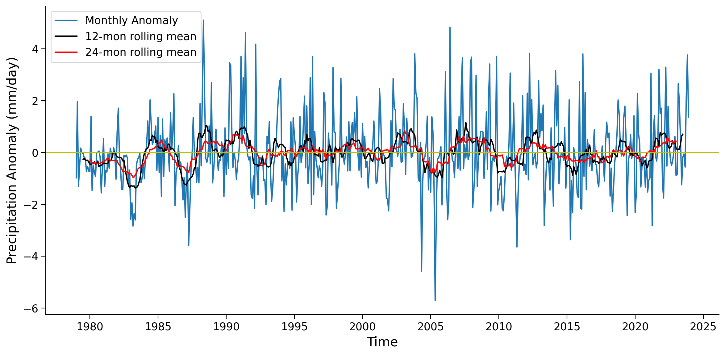
Questions 2.1#
What are the major differences you notice between the 12 and 24 month rolling averages?
What would generally dictate the window size to use in a rolling average of a satellite derived climate variable such as precipitation anomalies?
Section 2.2: Global Mean#
When examining global-scale changes, it is common to aggregate global mean values from all grid cells. However, it is important to note that despite each grid having the same resolution of 2.5°×2.5°, they represent different areas on the Earth’s surface. Specifically, the same grid covers larger spatial areas in the tropics compared to the polar regions as discussed in the climate system overview day.
To address this issue, it is necessary to weight the values based on their respective surface areas. Unlink the model data you used previously, where you had the grid cell area available as a variable, for our gridded observations we will use weights based on the cosine of the latitude as this function takes into account the decreasing area towards the poles.
# calculate the weights using the latitude coordinates
weights = np.cos(np.deg2rad(precip_anom.latitude))
weights.name = "weights"
weights
<xarray.DataArray 'weights' (latitude: 72)> Size: 288B
array([0.02181496, 0.06540319, 0.10886693, 0.15212344, 0.19509035,
       0.23768592, 0.27982906, 0.32143947, 0.36243805, 0.4027467 ,
       0.4422887 , 0.48098874, 0.5187732 , 0.55557024, 0.59130967,
       0.62592345, 0.6593458 , 0.691513  , 0.72236395, 0.7518398 ,
       0.77988446, 0.8064446 , 0.8314696 , 0.85491186, 0.87672675,
       0.89687276, 0.91531146, 0.93200785, 0.9469301 , 0.96004987,
       0.9713421 , 0.98078525, 0.98836154, 0.99405634, 0.99785894,
       0.999762  , 0.999762  , 0.99785894, 0.99405634, 0.98836154,
       0.98078525, 0.9713421 , 0.96004987, 0.9469301 , 0.93200785,
       0.91531146, 0.89687276, 0.87672675, 0.85491186, 0.8314696 ,
       0.8064446 , 0.77988446, 0.7518398 , 0.72236395, 0.691513  ,
       0.6593458 , 0.62592345, 0.59130967, 0.55557024, 0.5187732 ,
       0.48098874, 0.4422887 , 0.4027467 , 0.36243805, 0.32143947,
       0.27982906, 0.23768592, 0.19509035, 0.15212344, 0.10886693,
       0.06540319, 0.02181496], dtype=float32)
Coordinates:
  * latitude  (latitude) float32 288B -88.75 -86.25 -83.75 ... 83.75 86.25 88.75
Attributes:
    long_name:      Latitude
    standard_name:  latitude
    units:          degrees_north
    valid_range:    [-90.  90.]
    axis:           Y
bounds: lat_bounds# calculate weighted global monthly mean
anom_weighted = precip_anom.weighted(weights)
global_weighted_mean = anom_weighted.mean(("latitude", "longitude"))
global_weighted_mean
<xarray.DataArray 'precip' (time: 540)> Size: 2kB
dask.array<truediv, shape=(540,), dtype=float32, chunksize=(1,), chunktype=numpy.ndarray>
Coordinates:
  * time     (time) datetime64[ns] 4kB 1979-01-01 1979-02-01 ... 2023-12-01
month (time) int64 4kB 1 2 3 4 5 6 7 8 9 10 11 ... 3 4 5 6 7 8 9 10 11 12# create the time series plot of global weighted monthly anomaly
fig, ax = plt.subplots(figsize=(12, 6))
global_weighted_mean.plot(label="Monthly anomaly", ax=ax)
global_weighted_mean.rolling(time=12, center=True).mean(("latitude", "longitude")).plot(
color="k", label="12-mon rolling mean", ax=ax
)
ax.axhline(y=0, color="y", linestyle="-")
ax.set_ylabel("Precipitation Anomaly (mm/day)")
ax.legend()
<matplotlib.legend.Legend at 0x7f2d901d7cd0>
Coding Exercises 2.2#
Plot the 12-month rolling average of the difference between the global weighted and unweighted mean time series.
# calculate unweighted global mean
global_unweighted_mean = ...

# calculate different between weighted and unweighted global mean
# global_diff = global_weighted_mean - global_unweighted_mean

# plot the time series of the difference
# fig, ax = ...
Example output:
Questions 2.2#
Give one example of why the weighted mean might be higher than the unweighted mean, as in the 2000-2004 period.
Summary#
In this tutorial, you learned how to calculate a climate anomaly using satellite derived precipitation data.
The anomaly allows us to look at the signals that may be covered by the seasonal cycle pattern (e.g., temperature/precipitation seasonal cycle).
The anomaly data can be further smoothed using rolling mean to reveal longer-term signals at annual or decade time scale.
We will use the anomaly concept to study climate variability in the next tutorial.